UI/UX Review of a VST Plugin
Here’s a simplified example of how we review plugin UI and help take it from okay to good – or even great. So let’s dive right into 3 products.
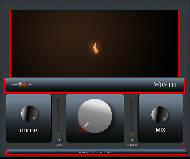
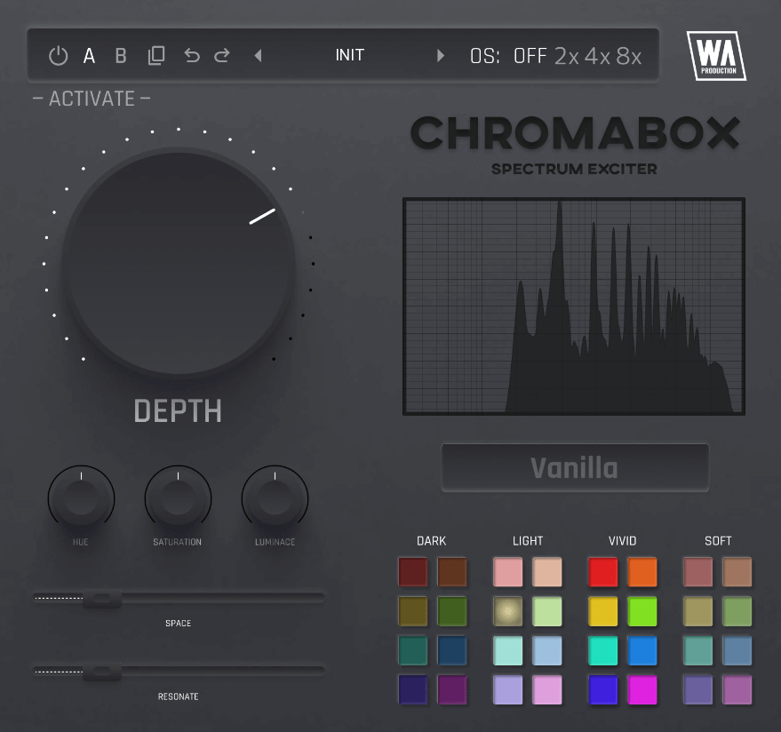
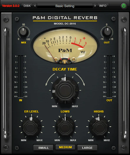
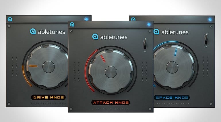
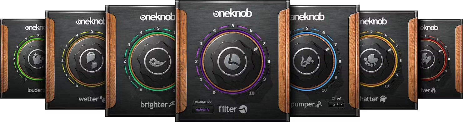
Product 1 — WRVTH
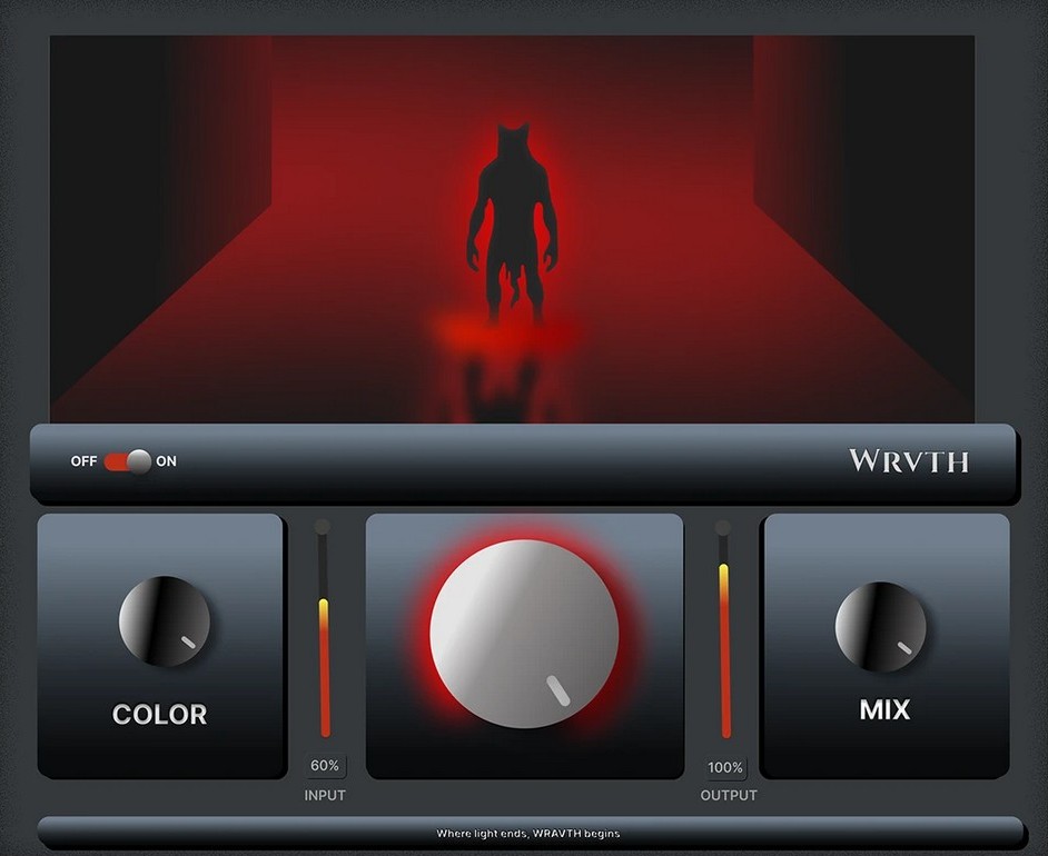
Product type
The main common feature of these products is that they perform a certain distortion function, adding characteristic harmonic components to the sound. This enriches the sound with unique nuances and a special color, giving it expressiveness and uniqueness.
Market Landscape
1. Product Intent & Positioning
The concept of a minimal, one-knob processor designed for fast results is clear.
However, this intent is not fully supported visually – the interface feels more complex and chaotic than the product actually is.
Recommendation:
Emphasize simplicity more strongly by establishing one clear primary control, a stronger visual hierarchy, and reduced visual noise.
Before: 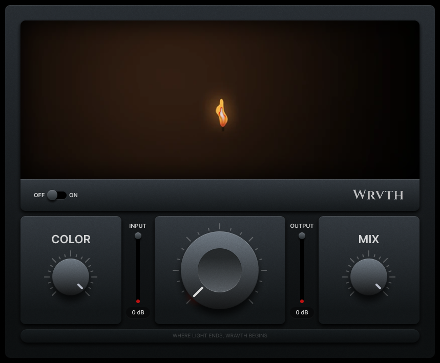
After: 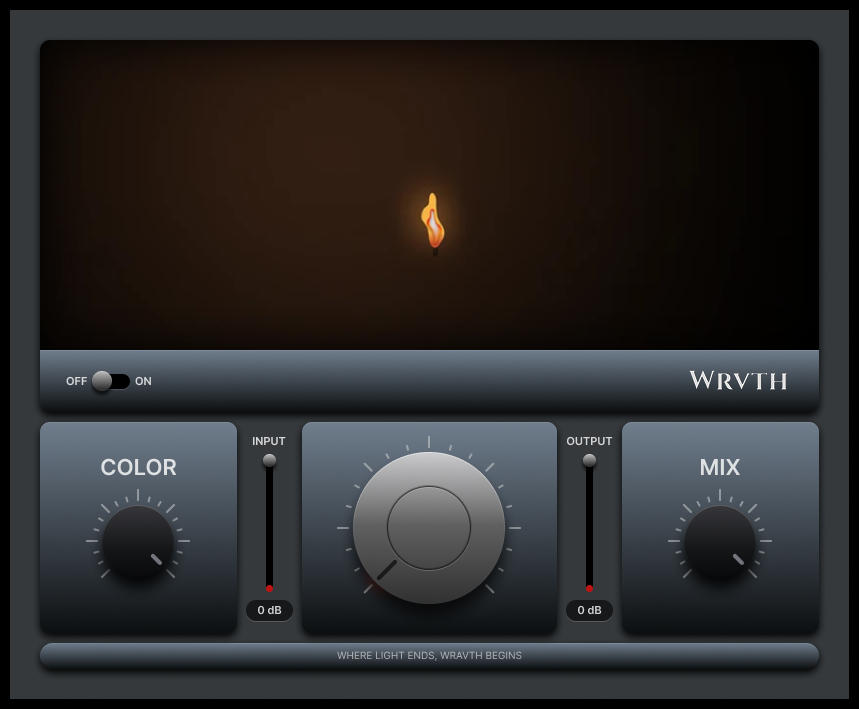
2. UX Structure, Logic & Interaction
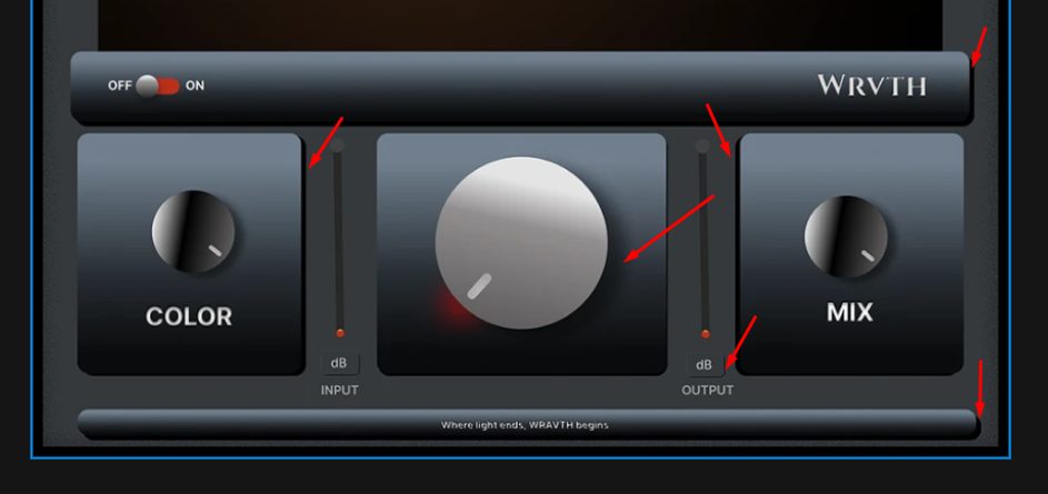
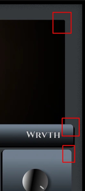
There is no clearly defined UX system yet – controls feel placed rather than intentionally structured.
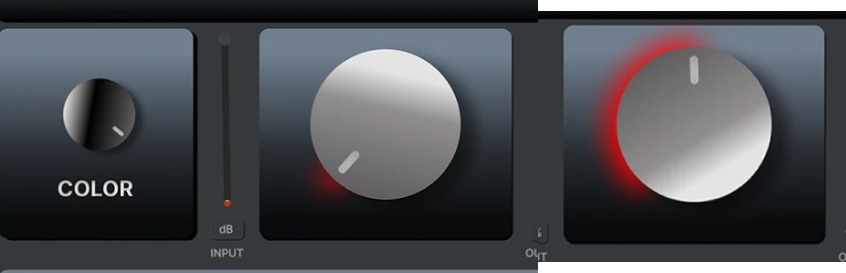
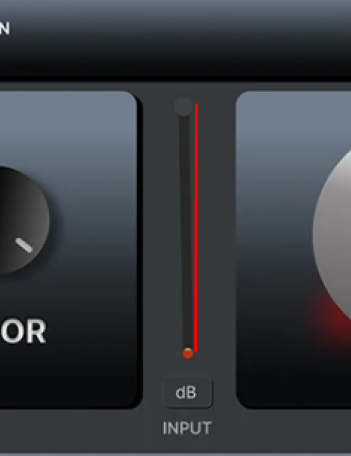
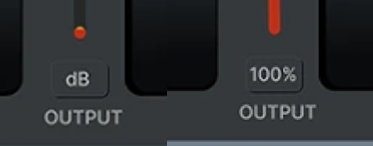
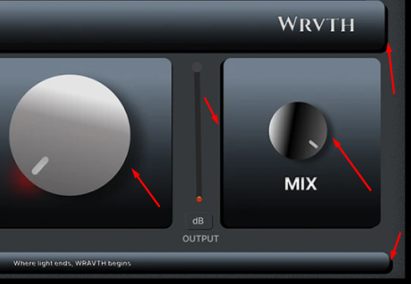
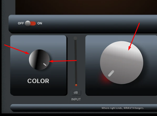
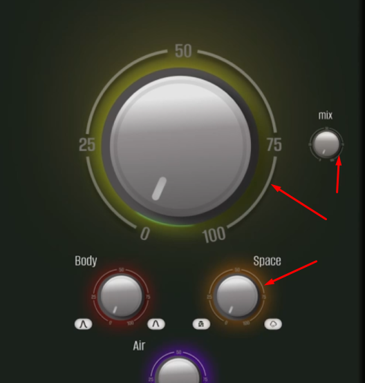
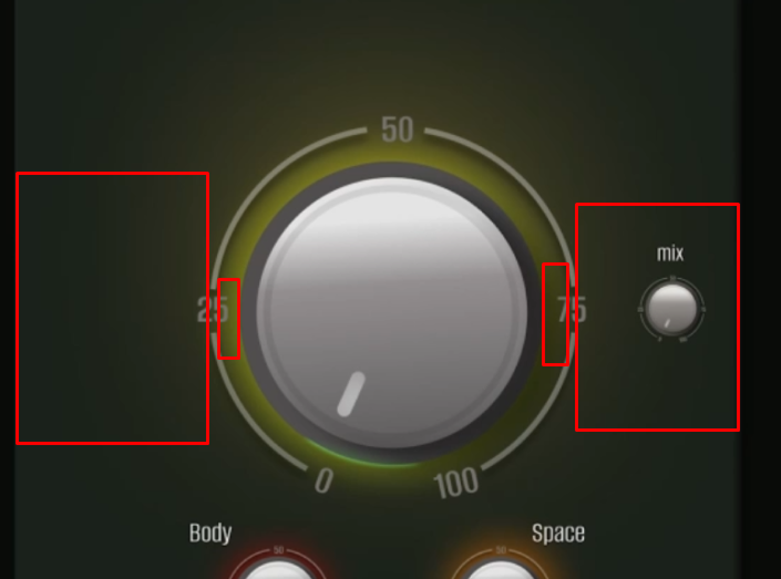
Meters are very small and positioned in the center, which reduces readability and visual importance.
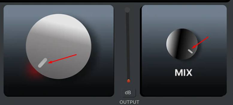
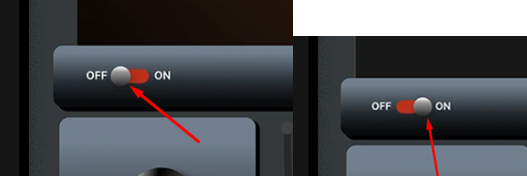
The knob animation is physically incorrect: the entire highlight rotates, which breaks the sense of material realism and perceived quality.
Scale behavior does not reflect real values:
rotation angles, 0–100 ranges, and tick marks do not correspond to the actual control behavior.
Recommendation:
Rebuild the UX around a clear usage scenario:
what is primary, what is secondary, and what is purely informative.
Redesign scales and animations so control movement feels honest, predictable, and physically believable.
To improve usability and correct frame construction in this product, it would be advisable to align the proportions, sizes of elements, and handle scales. It would also be advisable to add a header.
3. Layout & Composition
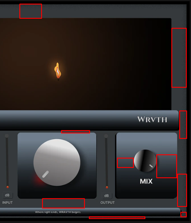
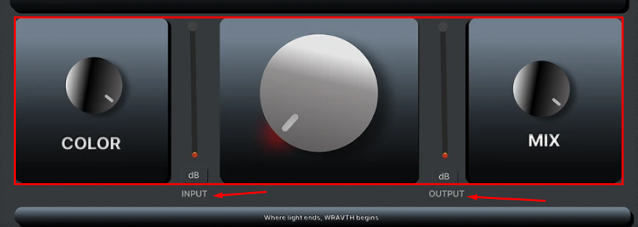
The layout feels fragmented.
The central animation, small meters, and bottom controls are not grouped into logical zones.
Recommendation:
Organize the interface into clearly defined areas:
header, main control, indicators, and secondary parameters.
Fewer visual focal points will result in greater clarity and usability.
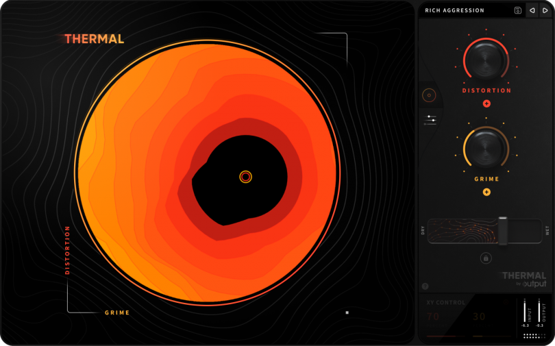
The main focus in these products is on decorative displays, which is why it occupies the largest part of the frame in all devices. In turn, this demonstrates the functional accessibility and usability of the products.
Layout Analysis
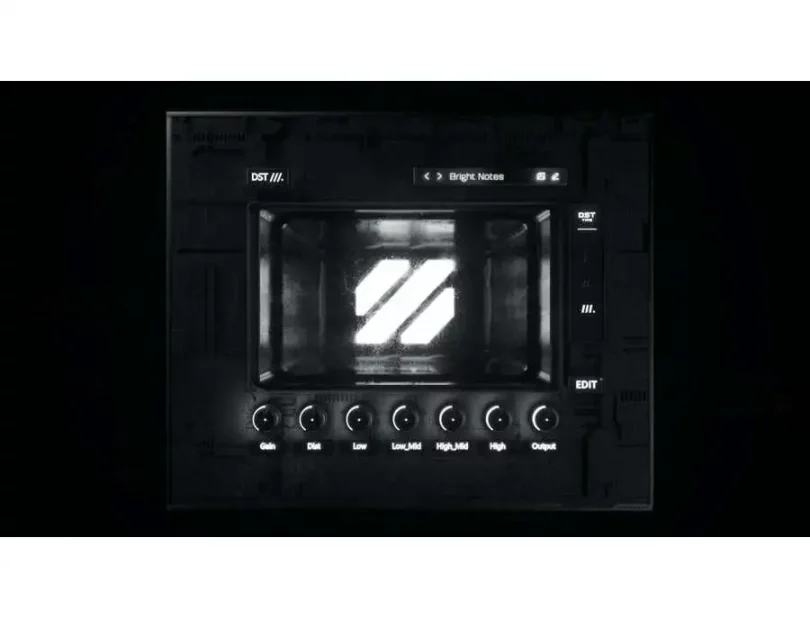
4. Visual Design (UI)
Lighting, shadows, and gradients behave inconsistently across the interface.
The intended material and overall visual style are unclear.
Mixed typography and inconsistent corner radii add to a sense of randomness.
Recommendation:
Choose a single visual principle (material, lighting model, contrast) and apply it consistently across all UI elements.
5. Consistency & System Thinking
The interface does not feel like part of a cohesive system or product family – each element appears to follow its own rules.
Visual Inconsistencies
Recommendation:
Even for a small product, a minimal design system is essential:
typography, corner radii, lighting behavior, and control logic should be unified.
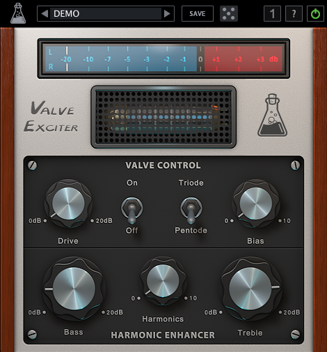
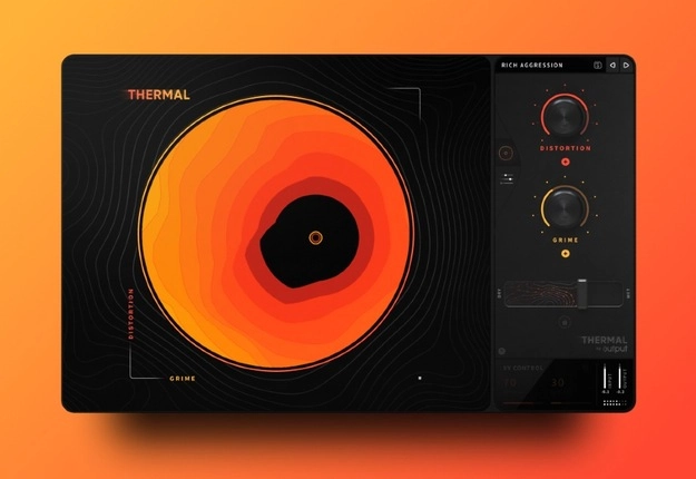
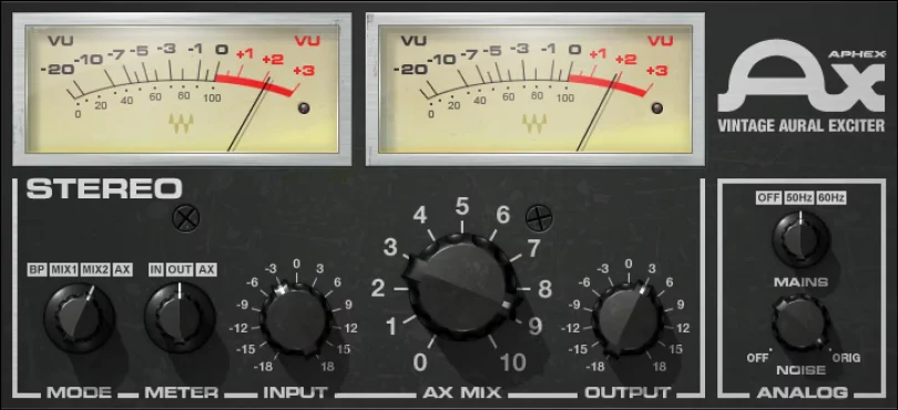
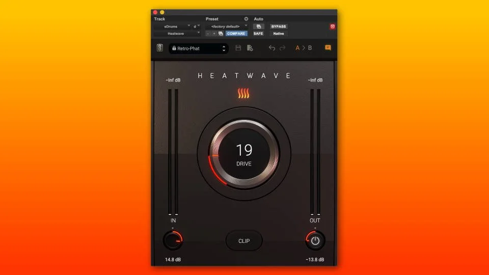
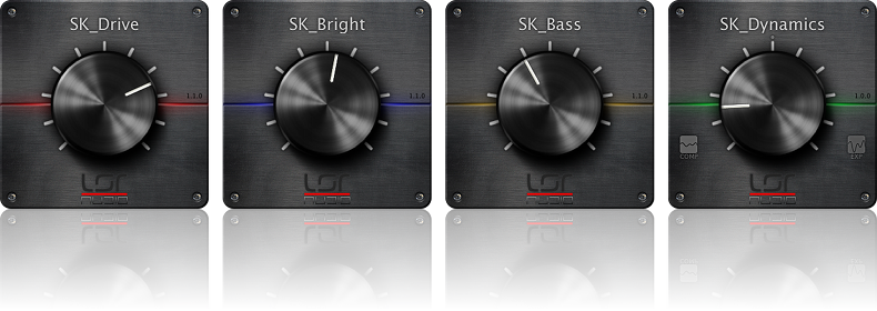
Product 2 — Voxelyth
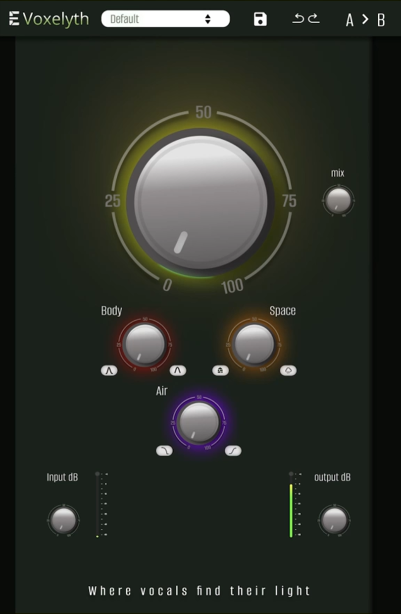
Product type
This group of products can be classified as Exciter.
The difference between EQ and Exciter is as follows.
EQ simply raises frequencies.
Exciter creates new harmonics, so the effect sounds more natural and richer.
Market Landscape
1. Product Intent & Positioning
The idea of a processor focused on vocal clarity, air, and harmonics is clear.
Visually, however, the product sends mixed signals.
Recommendation:
Strengthen the connection to vocals through cleaner, lighter, or more neutral visual choices.
2. UX Structure, Logic & Interaction
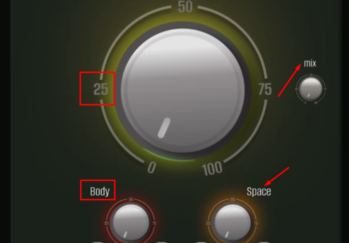
The overall UX is readable, but the control hierarchy feels inconsistent.
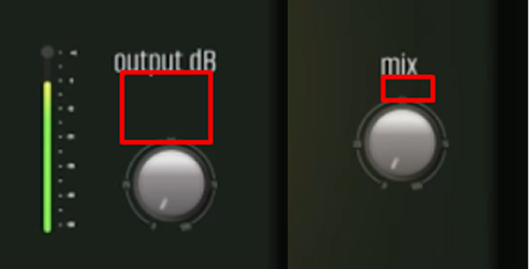
The Mix control appears somewhat arbitrary, In/Out buttons are too small, and secondary knobs are over-detailed.
Scaling seems to be achieved by simple resizing rather than thoughtful adaptation.
At smaller sizes, scales and numeric labels become difficult to read.

Recommendation:
Rebuild the hierarchy:
primary control → secondary controls → indicators.
Simplify graphics and adjust the level of detail appropriately for smaller controls.
The strengths of this product are the minimal number of controls, simplicity, and accessibility.
To improve structure and usability, it is necessary to change the proportions of elements, block layout, and handle scale alignment.
3. Layout & Composition
The layout is more structured than WRVTH,
but the central knob visually dominates more than the use case requires.
Recommendation:
Balance visual weight and allow the interface more breathing room.
These types of products are aimed at a wide audience, as they are as easy to use as possible.
The basis of the composition in these types of products is the central handle, which performs the main function in the device.
Layout Analysis
4. Visual Design (UI)
The muddy green background creates undesirable associations for a vocal-focused product.
Recommendation:
Shift the color palette toward tones associated with clarity, air, and transparency.
5. Consistency & System Thinking
Different knob sizes appear to be the same graphic simply scaled up or down.
Visual Inconsistencies

Recommendation:
Introduce different levels of detail depending on control size and importance.
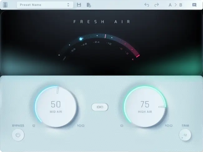
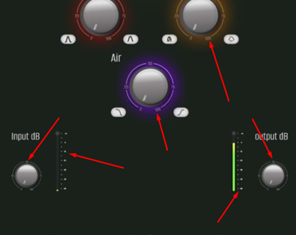
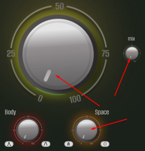
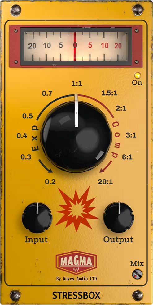
Product 3 — Elyth (Conceptual Plugin for Sound Motion)
Product type
These types of products are designed for vocal processing. They add airiness, detail, and crystal clarity to vocal parts. They emphasize accents and improve the clarity and detail of the sound. Such products can be classified as enhancers.
Market Landscape
1. Product Intent & Positioning
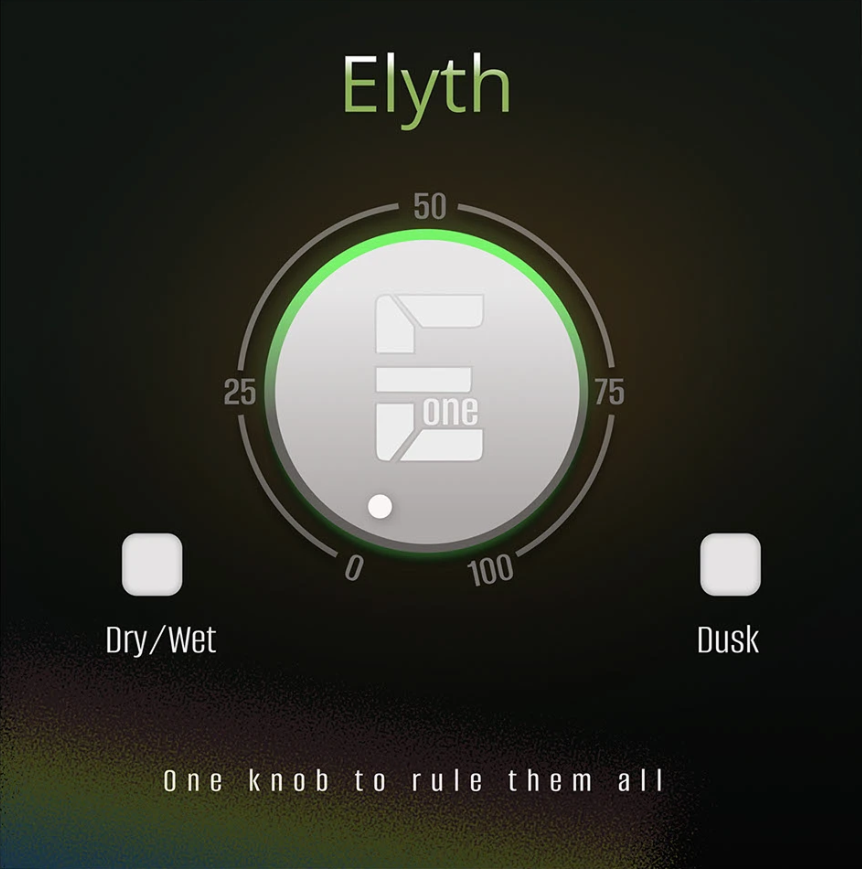
This is a very simple product built around a single control.
The intention is immediately clear and well communicated.
2. UX Structure, Logic & Interaction
The UX is clean and logical.
The main control behaves as expected, without unnecessary complexity.
The primary issue is that the scale does not match the physical rotation of the knob.
Recommendation:
Adjust the scale so numeric values accurately correspond to actual knob movement.
Among the main advantages of this product are a large number of settings, ease of use, and affordability.
To improve usability and ensure the correct frame design for this product, it is advisable to align the proportions of the elements, the layout of the blocks, and the alignment of the handle scales.
3. Layout & Composition
The composition is clean, calm, and well balanced.
Bottom buttons could be moved slightly lower to create additional breathing room.
These types of products are aimed at a wide audience, as they are as easy to use as possible. The basis of the composition in these types of products is the central handle, which performs the main function in the device.
Layout Analysis

4. Visual Design (UI)
The interface is neutral and non-distracting.
It supports the product’s function without drawing unnecessary attention.
Recommendation:
Slightly refine the knob form and material to add subtle character and polish.
5. Consistency & System Thinking
This is the most cohesive product in the series.
Recommendation:
It can serve as a visual and UX baseline for aligning the rest of the product line.